
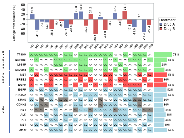
In this blog post we are replicating the picture below which was originally created in SAS
Let’s first generate some dummy data:
library(tidyverse)
n_pat <- 25
patient <- 1:n_pat
treatment <- sample(c("Drug A", "Drug B"), n_pat, replace=TRUE)
change <- rnorm(n_pat, 0, 20)
biomarkers <- c("T790M","Ex19del","L959R","Ex20Ins","MET","ERBB2","EGFR",
                "EGFR2","PIK3CA","KRAS","CDKN2","RB1","ALK","KIT","MET2",
                "Other")
genes <- matrix(sample(x=c("CC", "AA", "AC"), replace=TRUE, size=n_pat * length(biomarkers)),
                nrow=n_pat, ncol=length(biomarkers))
biomarker_groups <- c(rep("Baseline", 4), rep("SCNA", 3), rep("SNV", 9))
df <- data.frame(patient, treatment, change, genes)
colnames(df) <- c("patient", "treatment", "change", biomarkers)
head(df)
## patient treatment change T790M Ex19del L959R Ex20Ins MET ERBB2 EGFR EGFR2 PIK3CA KRAS CDKN2 RB1 ALK KIT MET2 Other
## 1 1 Drug B 17.3058647 AC AC AC CC AA AC AA CC AC AC AC AC CC AC CC CC
## 2 2 Drug B 8.1824572 AC CC CC AC CC AC AA AC AC CC AA AA CC CC AA AC
## 3 3 Drug B -18.5752930 AA AA AC CC AC AA AC AA AA AA AA AC AC AA AA AC
## 4 4 Drug A -5.2139298 AC AA AC AA AA AA CC AA AC AA CC AC AC CC CC AC
## 5 5 Drug B 5.6130694 CC CC CC CC AA CC AA AC AC AA CC AA AC CC CC ACWe have a patient number, treatment group and change in tumor size in our dataset. We also have collected some biomarkers so we may inspect if we find some interesting correlations.
In the picture above we have 3 distinct plots:
- The change in tumor size
- Highlighted genes in biomarkers
- Percentage of selected genes from each one of the biomarkers.
First plot
Plot is fairly standard barplot but there is some notable options that we need to set. First of all we notice that there is text indicating the change in tumor size outside of bars. The second thing we notice that the x-axis ticks are not just numbers but there is a custom string indicating that the ticks represent patients.
We can add the text to bar plots using geom_text but if you try it with only these we notice that the plot is not the most aesthetic. The stat = “identity” in the geom_bar means that we are providing our own values so the function is not trying to plot counts or something else.
df %>%
  ggplot(aes(x=factor(patient), y=change, label=change, fill=treatment)) +
  geom_bar(stat="identity") +
  geom_text()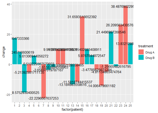
We can clip the text, rotate its angle and add some vertical adjustment to it so they line up nicely outside of the bar instead of at the edges.
The
hjust = ifelse(change < 0, 1.1, -0.3)
indicates that the horizontal adjustment goes to above the bar if the change is positive and respectively to the bottom of the bar if the change is negative.
With the x-axis ticks we can change the text with scale_x_discrete. For label values we paste the string “pat” and corresponding number together using paste0 command. And finally I’m changing the colors from light to darker to indicate importance.
p1 <- df %>%
    ggplot(aes(x=factor(patient), y=change)) +
    geom_bar(stat = "identity", aes(fill=factor(treatment))) +
    geom_text(aes(label=formatC(change, format="f", digits=0)),
              hjust=ifelse(change < 0, 1.1, -0.3), angle=90,
              vjust=0.35) +
    theme(axis.title.x = element_blank(),
          panel.grid = element_blank(),
          axis.text.x = element_text(angle=45, hjust=1)) +
    ylab("Change from baseline (%)") +
    labs(fill="Treatment") +
    scale_fill_manual(values = c("#0044ba", "#9e181c")) +
    scale_x_discrete(labels = paste0("pat", patient)) +
    ylim(min(change) - 10, max(change) + 10)
p1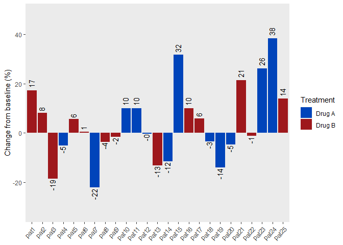
Second plot
First we need to create a dataframe were we have all the biomarkers, percentages out of those that have the selected gene and grouping for the biomarker.
genes_df <- df %>%
    select(all_of(biomarkers))

pcts <- colSums(genes_df == "CC") / length(df)

gene_pct_df <- data.frame(pcts, biomarker_groups, biomarkers)
gene_pct_df
## pcts biomarker_groups biomarkers
## T790M 0.3157895 Baseline T790M
## Ex19del 0.4210526 Baseline Ex19del
## L959R 0.3684211 Baseline L959R
## Ex20Ins 0.7368421 Baseline Ex20Ins
## MET 0.3684211 SCNA MET
## ERBB2 0.4210526 SCNA ERBB2
## EGFR 0.4736842 SCNA EGFR
## EGFR2 0.2105263 SNV EGFR2
## PIK3CA 0.4210526 SNV PIK3CA
## KRAS 0.1578947 SNV KRAS
## CDKN2 0.3684211 SNV CDKN2
## RB1 0.4210526 SNV RB1
## ALK 0.4210526 SNV ALK
## KIT 0.5789474 SNV KIT
## MET2 0.3157895 SNV MET2
## Other 0.4210526 SNV OtherFor the next plot I am using helper function percent that converts the decimal to percentages and adds the percentage sign
percent <- function(x, digits = 2, format = "f", is.float=TRUE,...) {
  paste0(formatC(100 * x, format = format, digits = digits, ...), "%")
}
This plot is similar to the first one but we have few notable differences. First of all the bars are horizontal instead of vertical.
Secondly the ticks from the axis are removed so they are not interfering with the other plots
First we create the plot with original rotation and at the last step we used coord_flip to flip it sideways. Changing the tick labels is done by modifying the underlying theme. Generally to move something from the plot we use “theme(something = element_blank())”.
One more thing that is absolutely necessary is to order the bars by groups. For this we firt create variable bio_factor that is just
numbers 1-3 according to which group they belong. Using this variable we can order the x-axis (later y-axis) by groups.
p2 <- gene_pct_df %>%
  mutate(bio_factor = as.numeric(factor(biomarker_groups))) %>%
  ggplot(aes(x=reorder(biomarkers, -bio_factor), y=pcts)) +
  geom_bar(stat="identity", aes(fill=biomarker_groups), show.legend = F) +
  geom_text(aes(label=percent(pcts, digits=0)), hjust = -0.2, size=3) +
  theme(axis.title.x = element_blank(),
        axis.ticks.y = element_blank(),
        axis.title.y = element_blank(),
        axis.ticks = element_blank(),
        axis.text = element_blank(),
        panel.grid = element_blank()) +
  ylim(0, max(pcts) + 0.3) +
  coord_flip()
p2
Last plot
This is the most complicated plot out of all three. In this plot there is a grid that is divided into subgroups by the biomarker groups. Certain grids with specific genes are colored differently than the others.
Before we use plotting functions we again add the bio_factor variable (as we did in the last step) and add color_scheme variable that tells what color each one of the cells should be.
We are creating the grid with geom_raster (we could also use geom_rect but according to documentation geom_raster is preferred when we have even sized squares) and adding the text as usually with the geom_text. To get the grouping working correctly we need to use facet_grid to break the plot into smaller grids and add options so the grids are closer together (I encourage you to copy the code and see what each one of the options does)
p3 <- df %>%
    pivot_longer(cols=all_of(biomarkers)) %>%
    left_join(., gene_pct_df, by=c("name" = "biomarkers")) %>%
    mutate(bio_factor = as.numeric(factor(biomarker_groups))) %>%
    mutate(color_scheme = case_when(
      value == "CC" & bio_factor == 1 ~ "a",
      value == "CC" & bio_factor == 2 ~ "b",
      value == "CC" & bio_factor == 3 ~ "c",
      TRUE ~ "d")) %>%
    ggplot(aes(x = factor(patient), y=reorder(name, bio_factor))) +
    geom_raster(aes(fill=color_scheme,
                    alpha=color_scheme),
                show.legend = F) +
    geom_text(aes(label=value), size=3,
              show.legend = F) +
    facet_grid(biomarker_groups ~ ., switch = "both", scales="free_y",
               space = "free_y") +
    scale_fill_manual(values = c("#F8766D", "#00BA38" ,"#619CFF", "white")) +
    scale_alpha_manual(values = c(0.9, 0.9, 0.9, 0.4)) +
    theme(axis.title.x=element_blank(),
          axis.ticks.y=element_blank(),
          axis.title.y=element_blank(),
          axis.text.x=element_blank(),
          axis.ticks = element_blank(),
          legend.title = element_blank(),
          panel.grid = element_blank(),
          panel.spacing.y = unit(-0.1, "lines"))
p3
Combining the plots
Now all there is left to this is to combine all three plots so that all the columns and rows are lined up. For this we are using library called cowplot. According to documentation of cowplot it is a library that
“provides various features that help with creating publication-quality
figures, such as a set of themes, functions to align plots and arrange
them into complex compound figures, and functions that make it easy to
annotate plots and or mix plots with images.”
Function plot_grid from cowplot package is used for creating table like layouts of plots. We can spesify how the plots are arranged and aligned using arguments ncol, nrow, align and axis.
First we need to remove the legend from the first plot so the aligning works better and add it back later.
library(cowplot)
p1_legend <- get_legend(p1)
p1 <- p1 + theme(legend.position = "none")
Here we saved the legend from the first plot into variable called legend and set the legend hidden in the original plot. Now we are going to do nested plot_grid.
- First we align change plot with the geneplot
- Second we align the legend from the first plot with the barplot
- We align the first two plots adjust the width of the plots usign
rel_widths argument so that plots on the left are larger than plots
on the right side. - And finally we draw the aligned plot using ggdraw function.
ggdraw(plot_grid(
    plot_grid(p1, p3, ncol=1, align = "v", axis="lr"),
    plot_grid(p1_legend, p2, ncol=1),
    rel_widths = c(1, 0.2)
  ))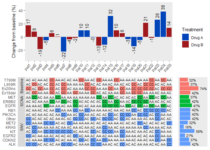
Finally we have created a plot that we tried to mimic.
Code it took to recreate this figure is a bit shorter than the code used for creating it originally in SAS. I will be posting the original SAS code in our GitHub pages and I will update the URL in here after that. One downside is that the plots need quite a bit of extra options and tweaking to get them looking right.
EDIT:
Link to the SAS code
Mikael Roto
4/8/2021